

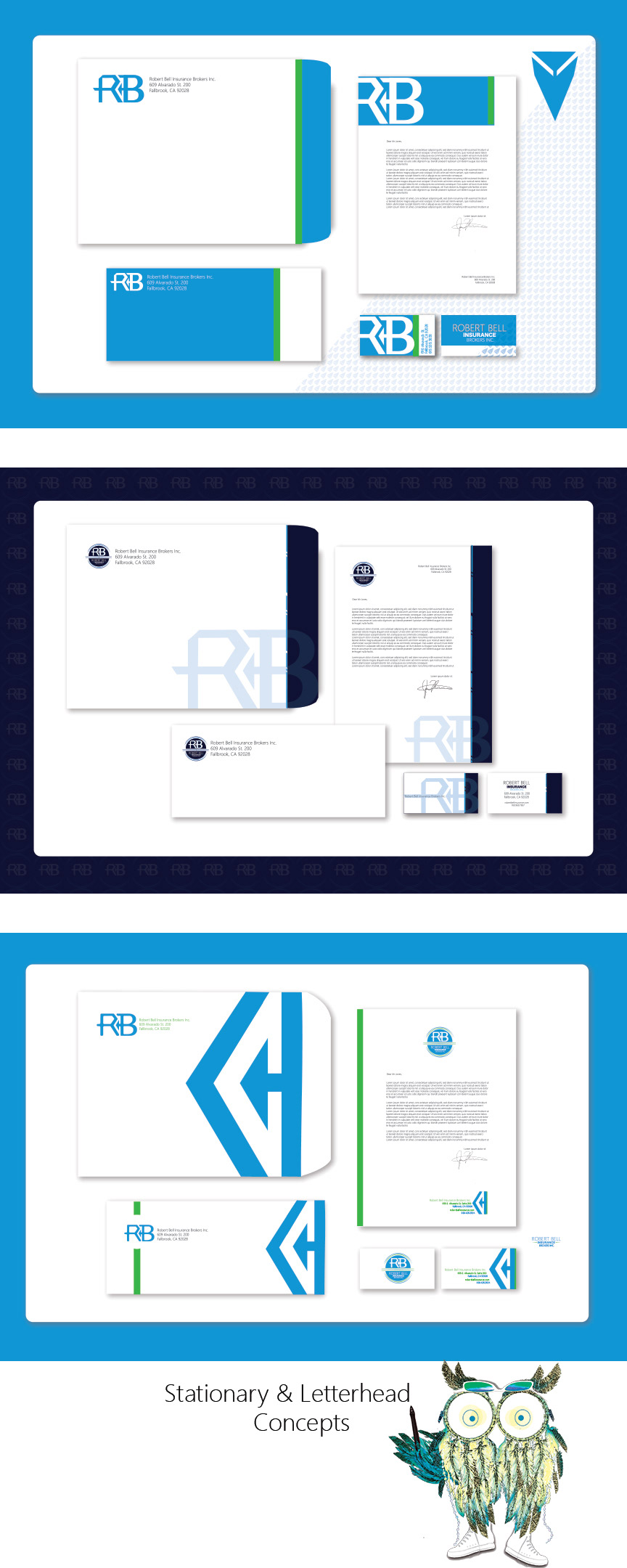
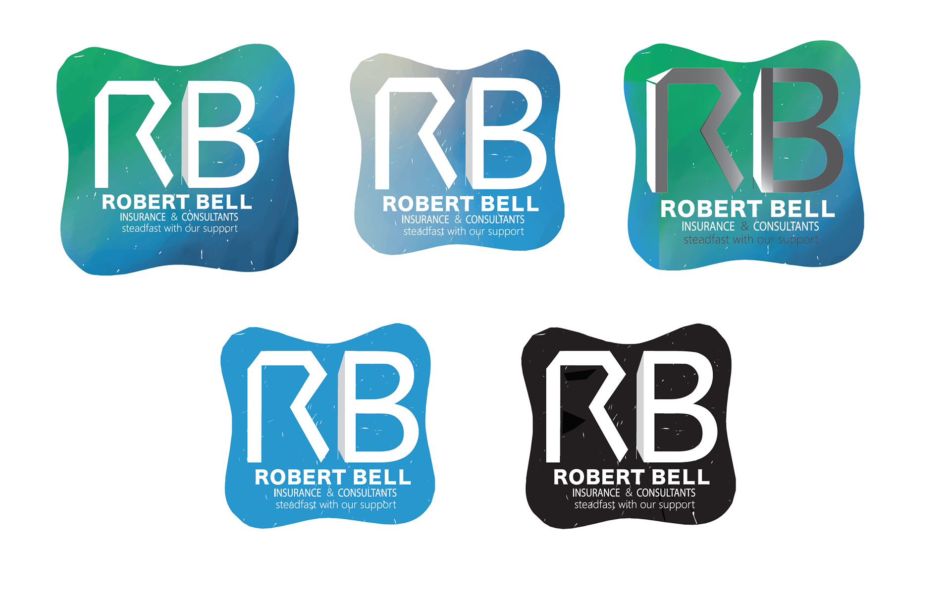
Several layout variations incorporated with a custom watercolor pattern.
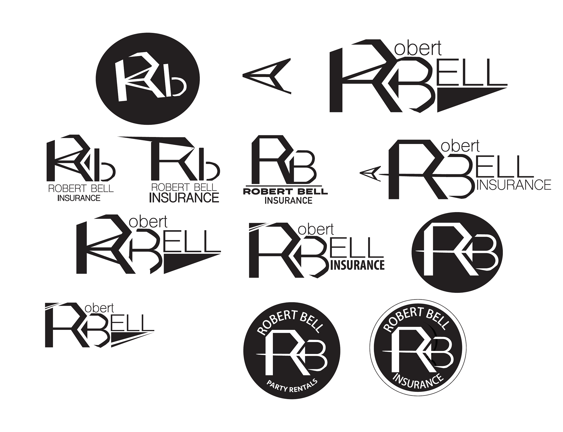
Robert Bell Logo Studies
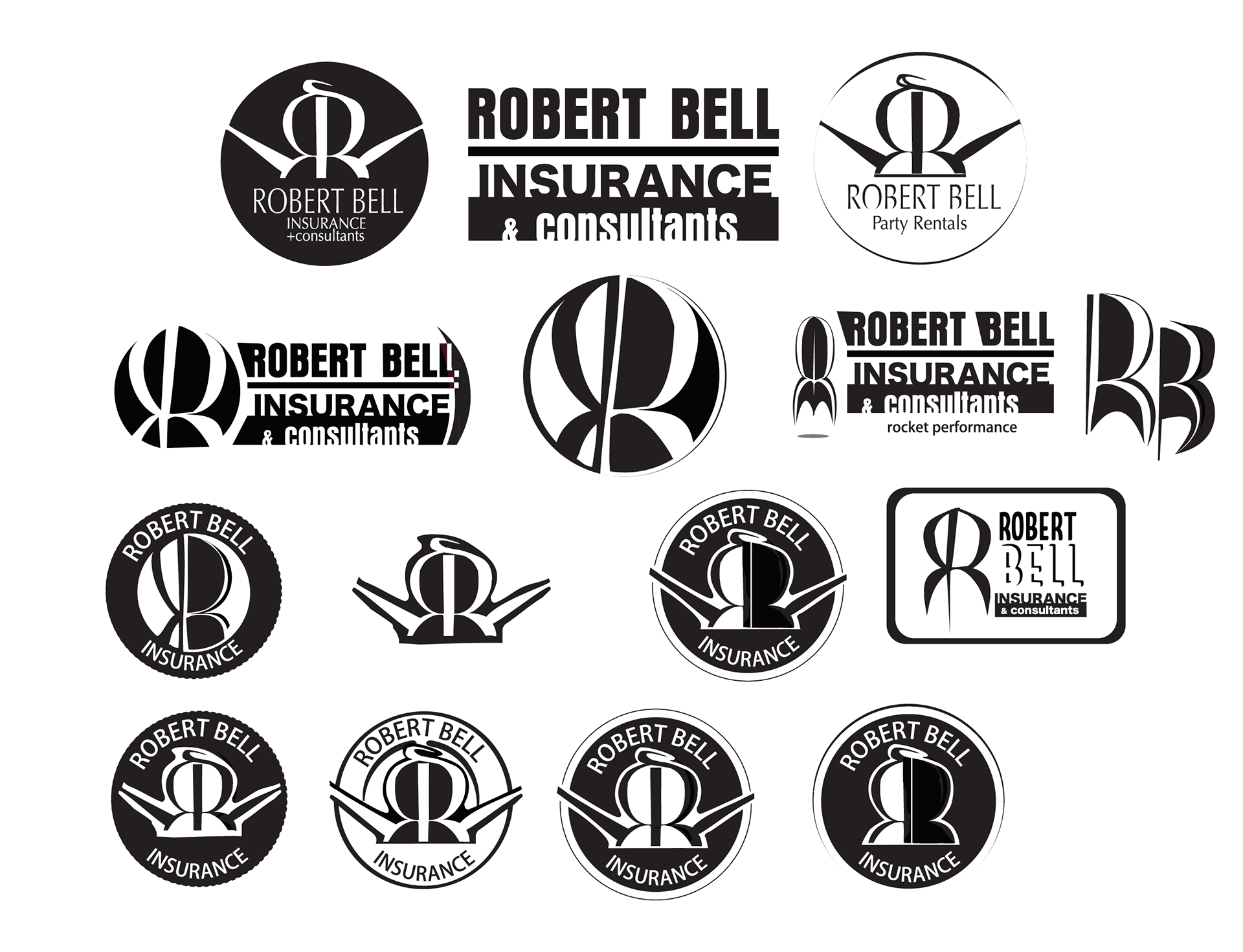
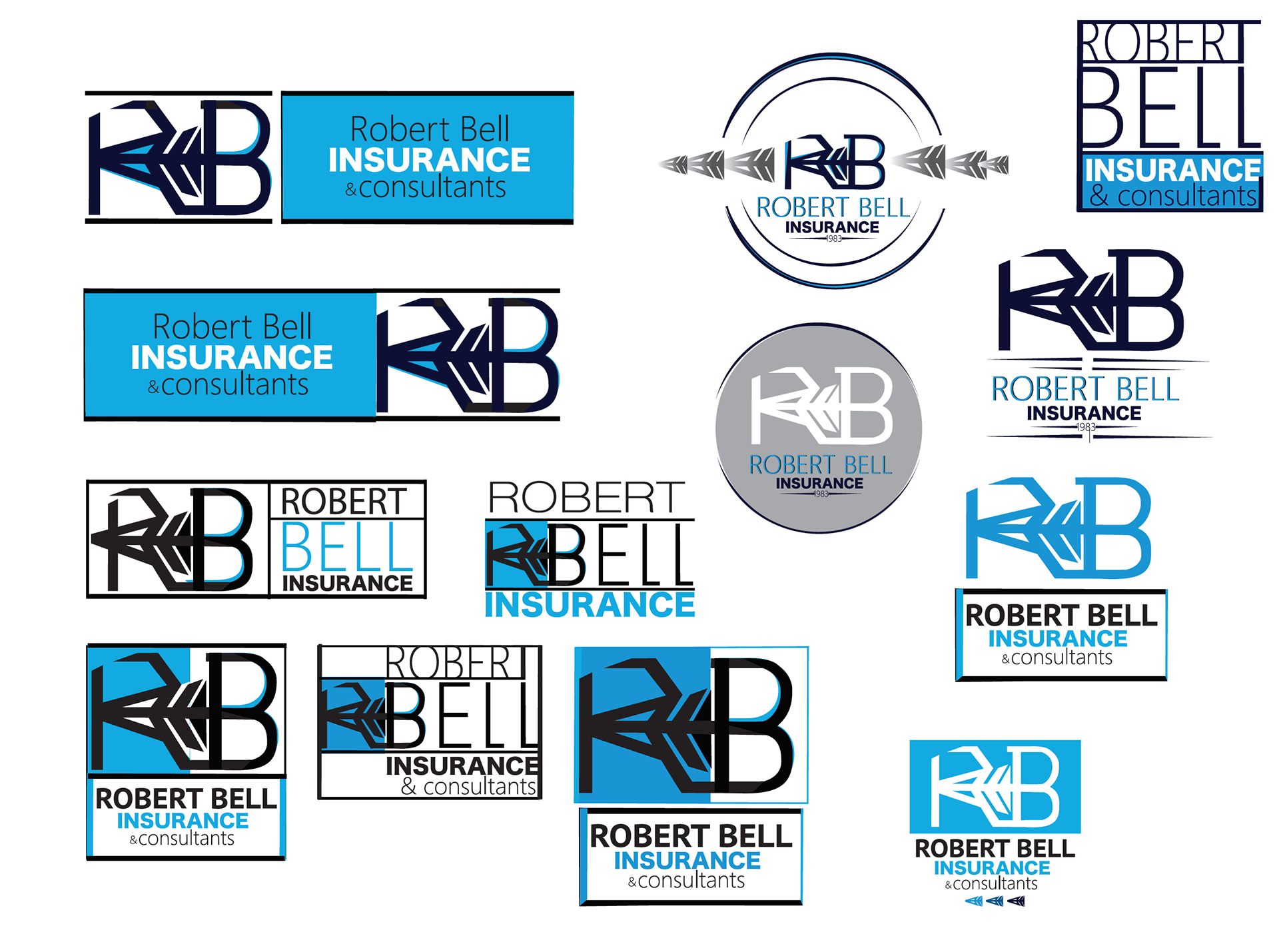
Here are some more studies. Robert Bell also does party rentals to. I was trying to make the letter "r" and "b" into a little guy that could represent both the insurance company and the party rental side as well.

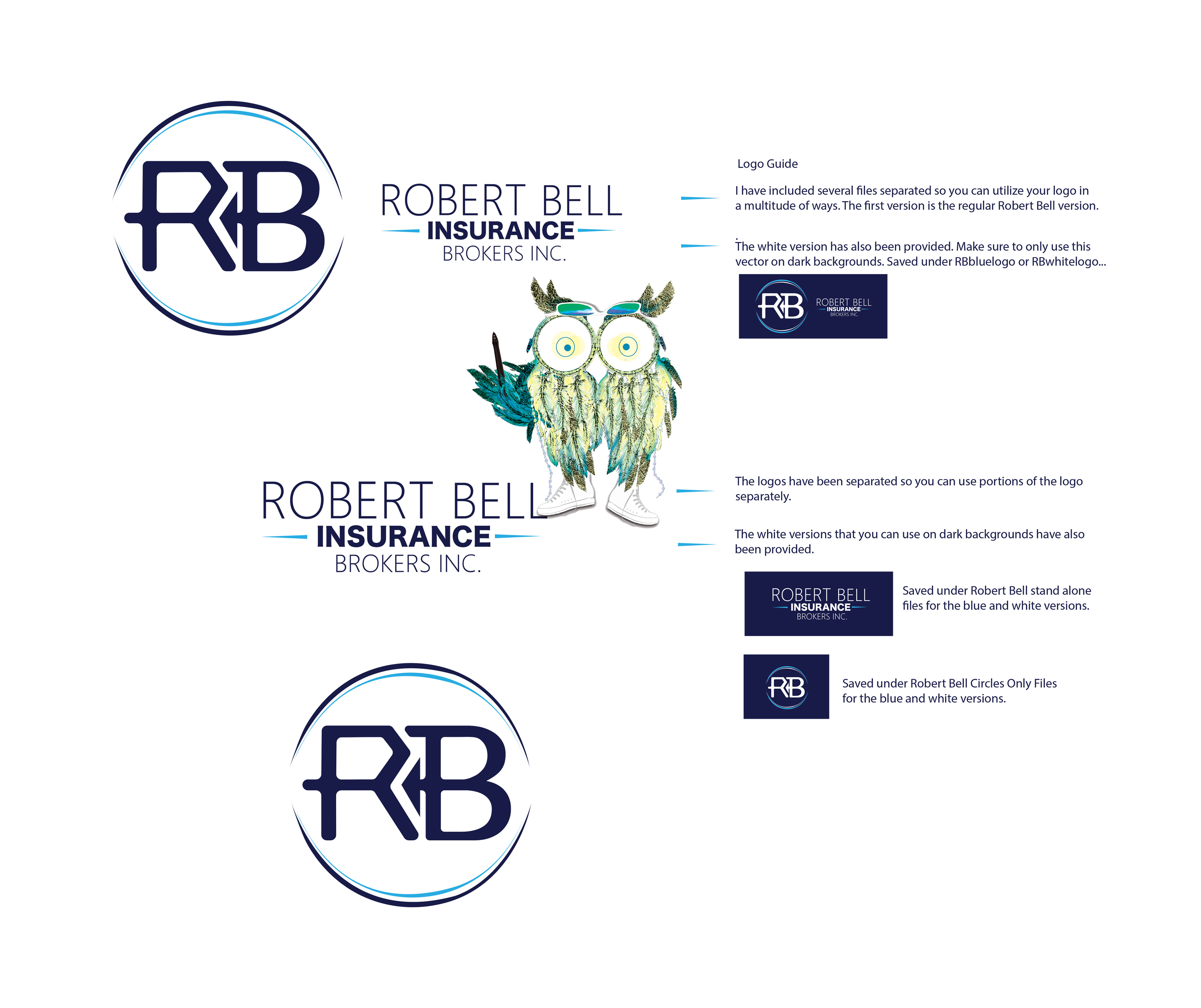
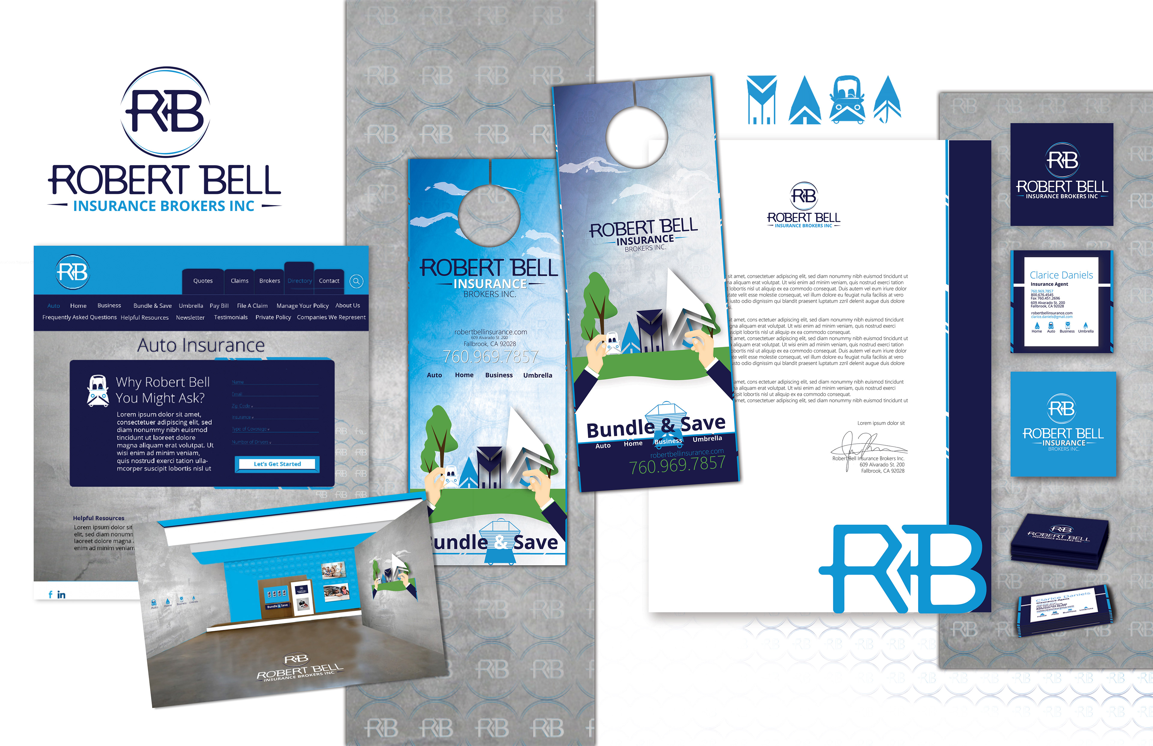
1st place logo chosen for Robert Bell Insurance Brokers.

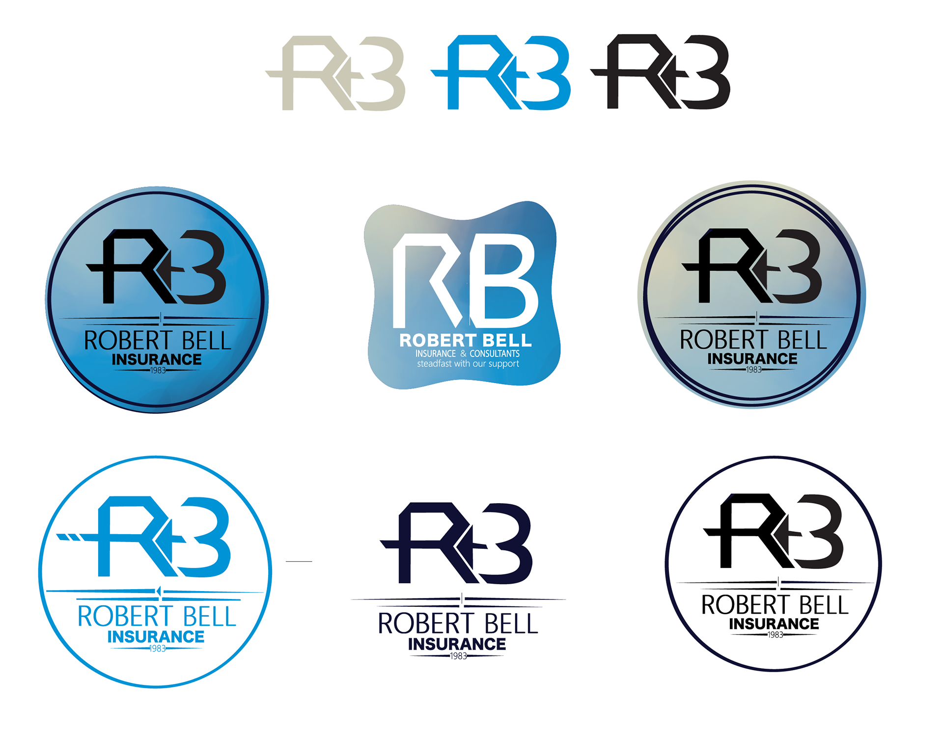
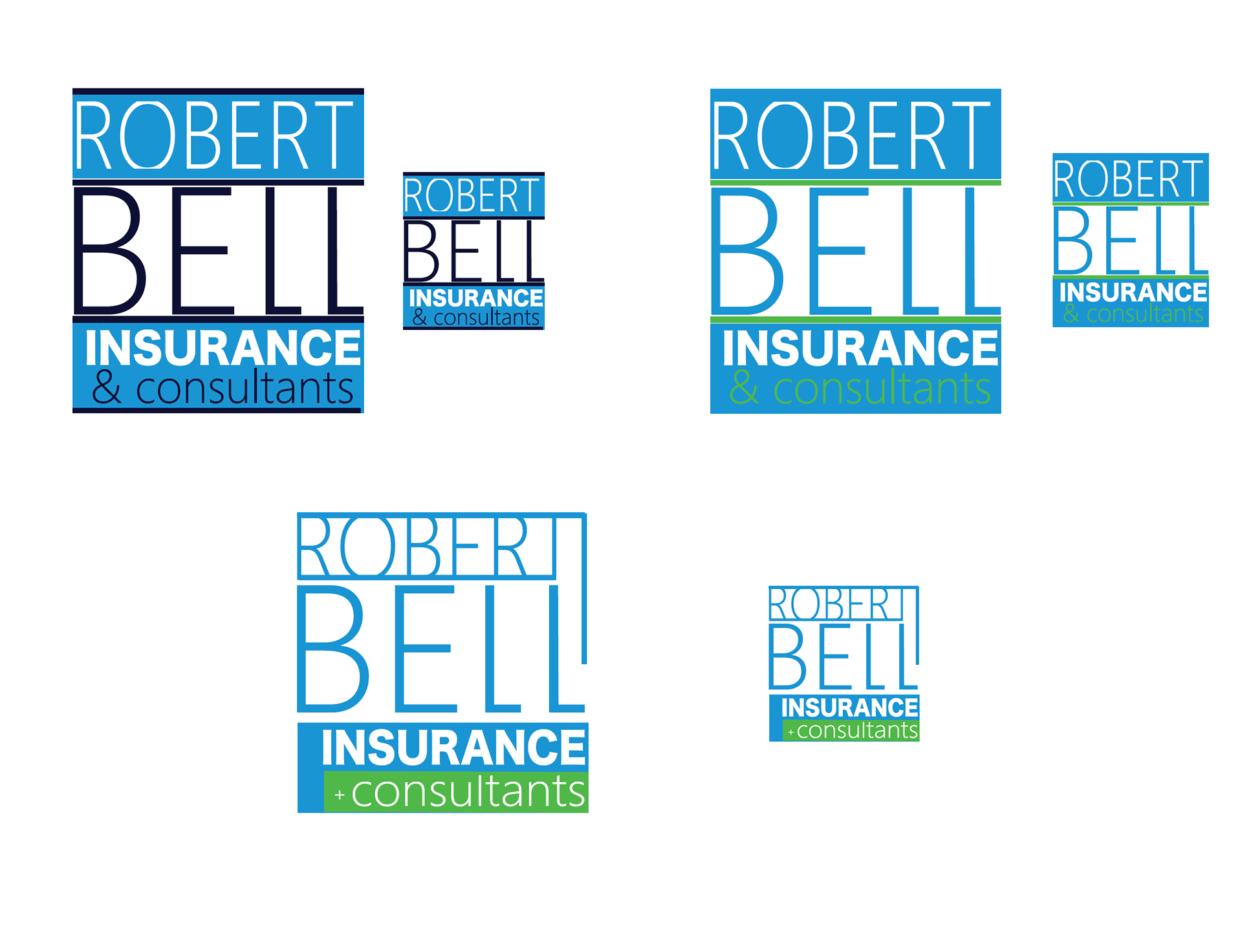
Incorporating color, the client really loves the color blue.
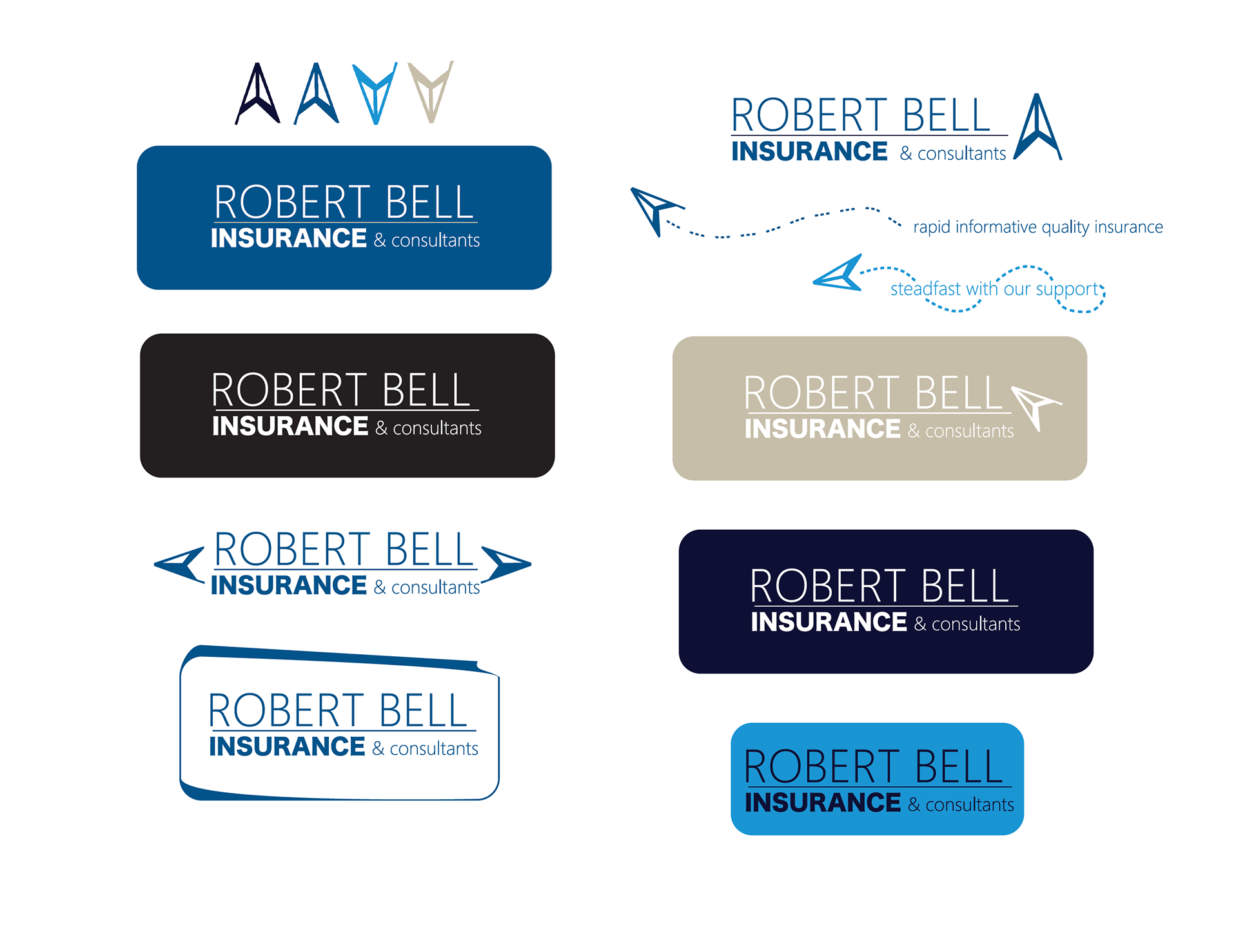
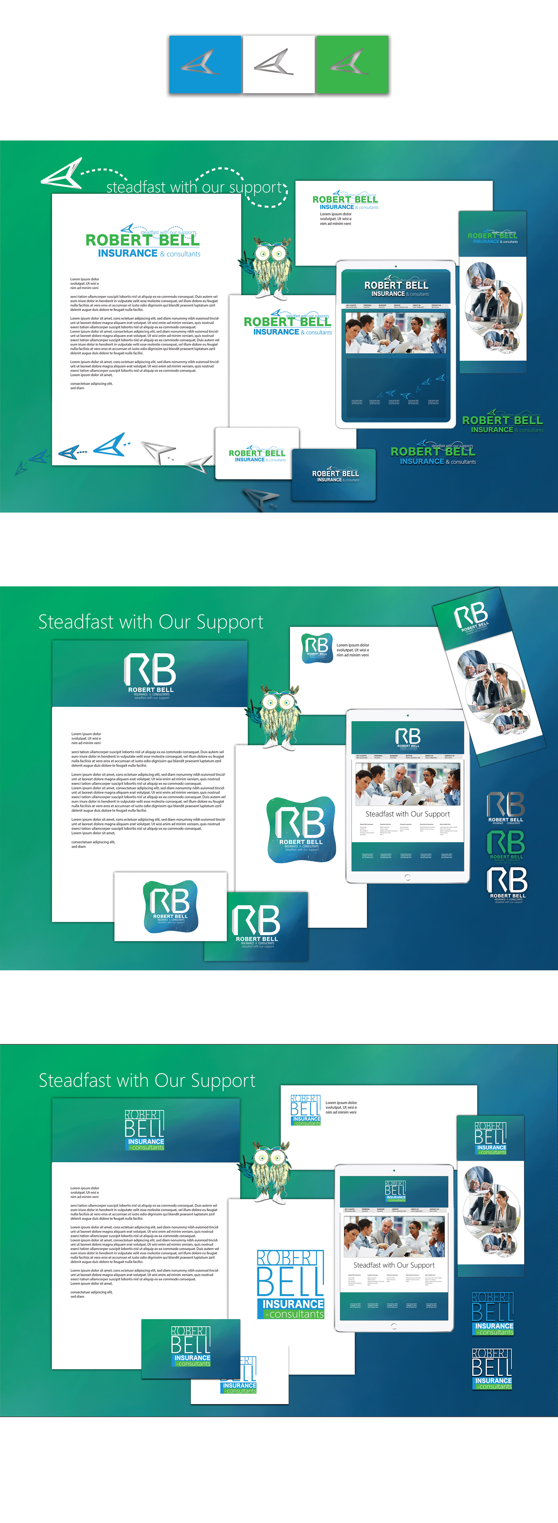
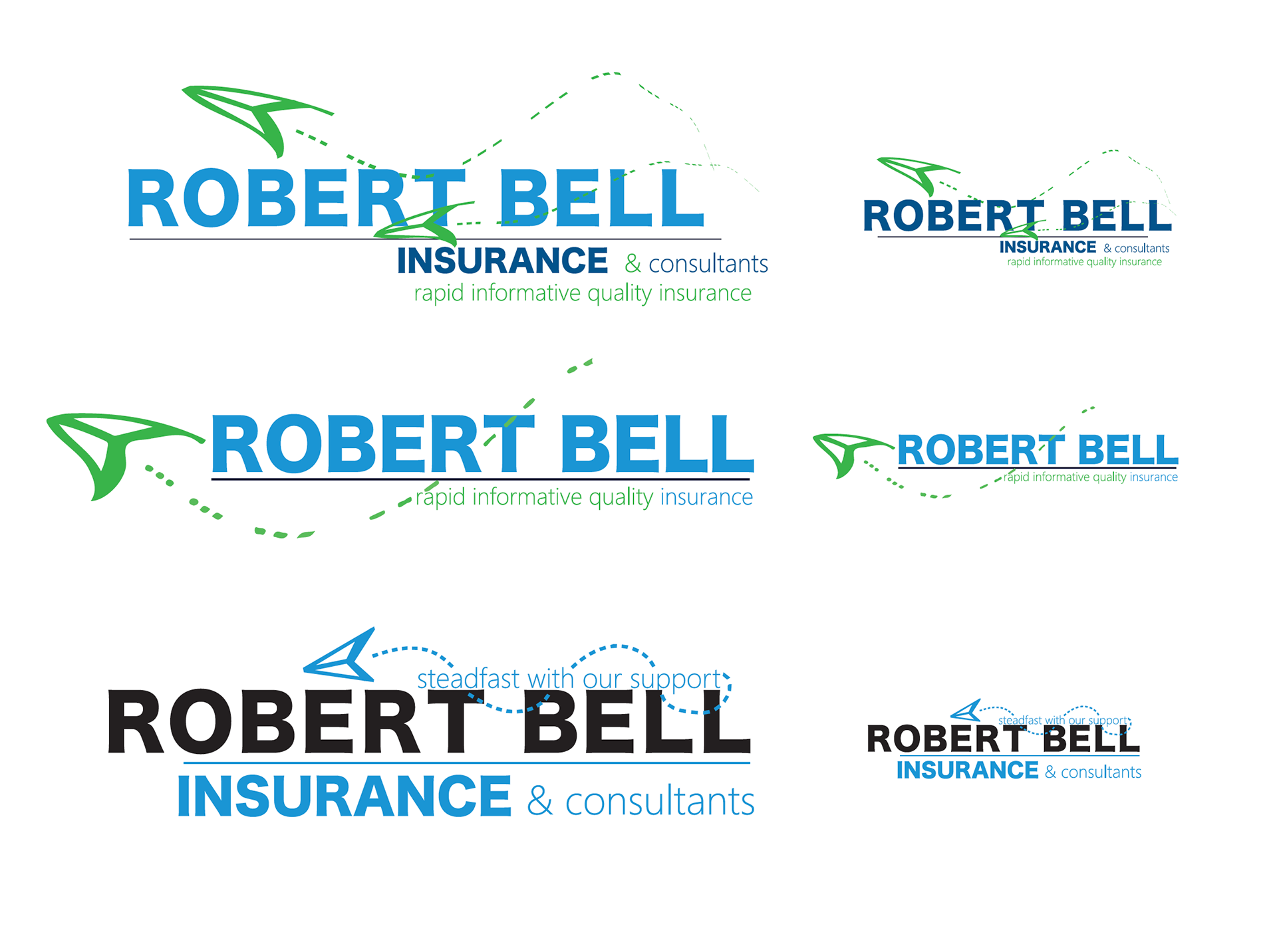
Here I was going for more of a modern take on the logo. The icon can be a multitude of things such as a paper plane, a rocket, or the company can use it as an arrow. Using a bell would have been to cliché. The slogan works well with the icon as well "steadfast with our support".
Here I stepped outside of the box, maybe a little too much for an insurance company but just playing around leads to wonderful results.


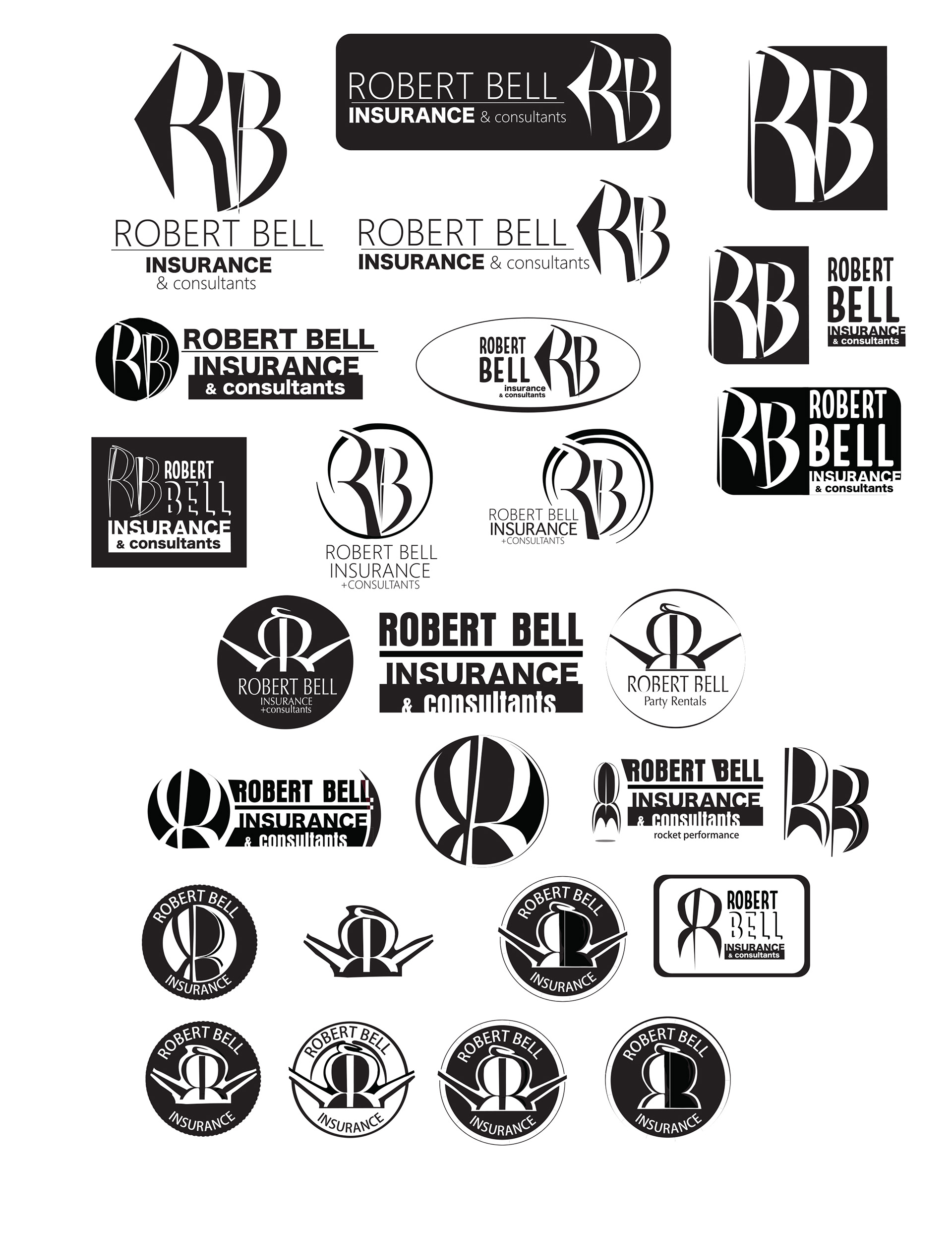
Came down to these three designs. I wanted to give the client multiple options to choose from. The first logo is more of a graphic and fun take on an insurance logo. They don't all have to be boring. The second is a more standard type of logo that you would typically see for insurance companies. The last one is a contemporary take on the logo, that was inspired by real estate signs.